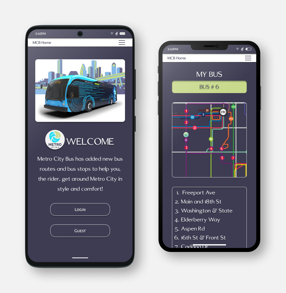
The Client
Metro City is a booming midwestern metropolis with an expanding public transportation system. In order to keep up with its growing population, Metro City Transit Authority has expanded its Metro City Bus (MCB) services. Now offering more stops and more routes in the heart of the city.
Overview
The Problem
With the expansion of Metro City’s public transportation system, some areas now have multiple bus lines serving the same stops. Riders are having difficulty adapting to the new system and are quickly becoming dissatisfied. MBC needs an updated way to get information on changing bus schedules, routes, and stop locations to its riders quickly and efficiently.
Client Requirements
Ensure that any rider can tell when each of the buses arrives at a certain bus stop.
Ensure that all riders can tell how much time they have to get to the bus stop before the bus they need arrives at that stop.
Allow riders to select one of the multiple bus lines at a certain bus stop and see a list of its future arrival times.
The Solution
Design a mobile application that allows users to access real-time bus schedules
Give users the ability to save a bus route or bus stop to their account for fast easy access
See live locations of buses
Find a way to have a lot of information on a single page
The Process
Who are we here to help?
The persona of a daily bus rider in Metro City.
User Stories
Created to understand a daily occurrence in the life of our users.
RJ has downloaded the Metro City bus app. In the past, RJ has had problems missing his bus, even though his bus stop is very close to his house. The bus is sometimes early Even if RJ is at the stop a few min before the scheduled time, he can still arrive after the bus has departed. Today RJ will look to see where the bus currently is and when it will be arriving at his stop.
“As a bus rider, I need to know where the bus is and when it will be at my stop, so I know how much time I have to get there.”
It is currently 7:07 a.m. RJ is getting coffee at his local shop across the street from the bus stop he uses to get to work. RJ wants to check where the bus is and when it will be at his stop.
RJ opens his Metro City Bus app. Low Priority
RJ clicks on the top corner menu. Medium Priority
RJ clicks on MY BUS STOP. High Priority
A screen labeled MY BUS STOP opens on his phone with a map.
RJ scrolls below the map to an information screen. Medium Priority
RJ now knows he has 3 min until the bus arrives at his bus stop, and 8 min until the bus departs his stop.
What problems are they facing?
Empathy Maps are designed to get in touch with user behaviors and feelings. To help me understand their motivations, concerns, and experiences.
How do we understand our users needs?
Through user surveys, I was able to more deeply understand how people felt towards public transportation, and what caused their opinions.
During user interviews, I began to paint a picture of what I needed to do, and how to get there.
55.6% of riders are unsure of their understanding of the bus schedule and bus times.
72.7% of riders are afraid of missing a connecting bus.
53.5% of riders are afraid of missing the bus due to misunderstanding the bus schedule.
77.8% of riders want the ability to save a bus route or bus stop for future reference.
88.9% of riders want live bus tracking.
Competitive Analysis
I chose to research Citymapper because of its well-known transportation app as well as M Metro as it was built for a major metropolitan area.
Citymapper
Strengths: Fun, colorful, great use of space, great button interactions.
Weaknesses: Users can’t just type in a city. The user has to click on cities, then search through a ton of cities until one finds needed city.
M Metro
Washington Metropolitan Area Transit Authority
Strengths: Easy reading, accessibility seems well thought out, nice color scheme.
Weaknesses: The site feels old and outdated. Hierarchy needs work.
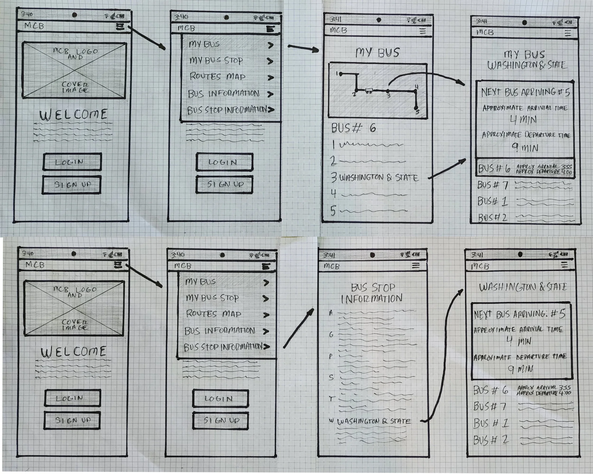
Sketches
My first thoughts of how the app should look and function.
User Flows
As a bus rider, I want to know when my bus is arriving at the Washington & State bus stop, so I can calculate how much time I have to reach the bus stop.
As a bus rider, I want to know the next bus arriving at the Washington & State bus stop, so that I don’t rush to the bus stop if it is not my bus.
As a bus rider, I want the ability to view future arrival times for any of the seven bus lines (serving Washington & State), so that I know when my bus arrives.
Sitemap
A simple visualization of how one would navigate the app.
Moodboard
A visual representation of how I envision the app in my head.
Wireframes
Starting to turn thoughts and ideas into a workable prototype.
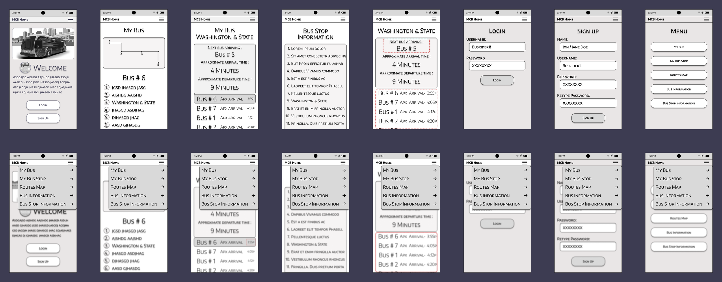
Lowfi Prototype
Adding the elements to make a wireframe come to life.
Clickable Prototype
Elevation with color, shapes, and pictures makes my prototype become lucid.
I broke up some of the information screens to provide more distinction in info while keeping sections aligned that belong together.
The Test
Why we test?
Can riders navigate the application to find the information they need?
Is the information easy to locate?
Is the information understandable?
What the test requires?
Test subjects were asked to complete multiple scenarios live on a mobile device, or via media conference using screen share. Allowing me to observe how they chose to navigate to specific information.
The results.
Even though the testers were able to get to the information quickly and efficiently, other problems arose that were unknown to me.
One of my ideas to help the user find bus information in as few steps as possible, was to create the ability to save a bus or bus tops one uses consistently.
During testing on the “My Bus” information page, even when highlighted, the position on the screen in relation to text made it confusing for users to differentiate “my bus” time from other bus times. In order to correct this I did a full page overhaul. Information becomes clear and direct by bringing the highlighted “My Bus” section to the top of the page with a new title style.
Another confusing moment was having different time formats, which confused users and made it difficult to understand bus arrivals and departures. I realized I needed time format consistency. Changing all time formats to only show the actual arrival and departure times. This gives the user a definitive time instead of a “minutes until” countdown forcing them to do math to calculate what time a bus would be arriving.
The Prototype
The next step was to deliver a polished prototype. I implemented what I learned during user testing, but wasn’t quite happy with the final product
I felt the style was basic, modeled off apps I remembered using years ago. So I gave the whole feel a face life. Modernizing and simplifying. I also realized the new look helped give the app easier visual accessibility. creating better spacing, larger visuals, and beautiful contrast between information, buttons, and images.
Final Thoughts
I am immensely thankful for the opportunity to work on this project. It opened my eyes to a lot of concepts in UX/UI that I thought I understood but now realize need to be experienced to begin to grasp. In other design projects I’ve done in the past I didn’t have as much need for empathy.
Construction design tends to have one digging more into the designer’s artistic preference. I could design something the client would love using current trends, favorable looks, and moods.
When I got into the depths of this project, I soon understood why it was important to know who this app was being created for and why knowing their pain points, goals, and how it affects their daily lives was so important.
Even though I'm a people person, I was nervous about conducting user surveys and interviews. It was such a new concept to me. The information collected and the conversations had, were priceless.
After all, we are all designing for the user, not ourselves.


