The Client
Through fitness, home organization, and proper nutrition, The Vertical Body helps to establish healthy lifestyle choices. As a result, senior citizens become more independent and self-reliant.
Overview
The Problem
The Vertical Body was looking to bring three decades of senior fitness experience to the digital world.
The first direction they wanted to move into was designing a senior-friendly website. One clients can easily access that allows them the ability to:
Watch fitness videos
Look up fitness details
Get nutritional information
Order fitness equipment
Get help with life and home organization
Individualize their programs
Client Requirements
Ensure clients can access fitness and lifestyle information easily and efficiently.
The ability to watch workout videos at home or on the go when clients can’t meet in person.
Give clients the ability to order fitness products directly from the website.
The Solution
Design a desktop website that is accessible to all, easy to navigate, and helpful to elderly clients.
Create a simple video library capable clients can navigate efficiently.
Create an e-commerce storefront within the website to access products.
The Process
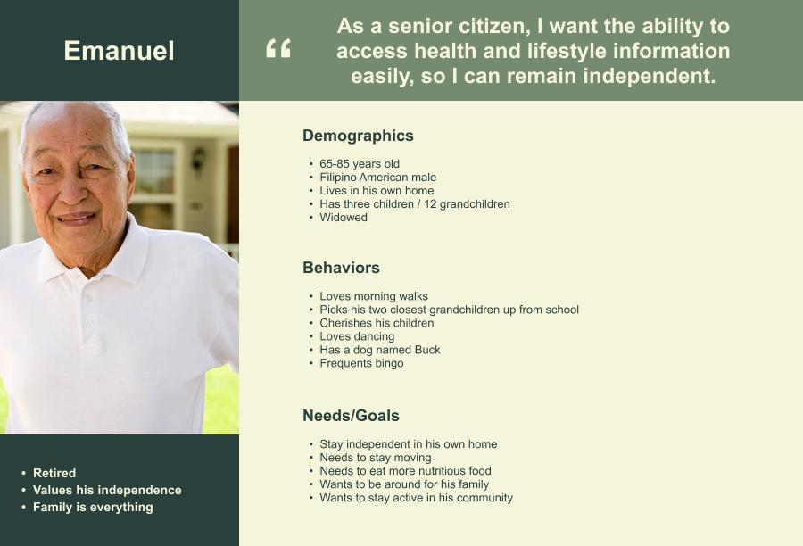
Who are we here to help?
The persona of a person ready to better their life!
User Stories
Created to understand a daily occurrence in the life of our users.
Emanuel is ready to jump-start his healthy lifestyle. He has met with his trainer at The Vertical Body where they helped him organize this home, create healthy dietary options, order fitness equipment, and create a fitness program catered to his hopes and goals. Today Emanuel is going to watch a workout video at home and work up a sweat!
Emanuel turns on his computer. Low Priority
He signs into The Vertical Body. Medium Priority
The menu page
Emanuel clicks on the Fitness category. Low Priority
Fitness page
He chooses which workout he’d like to challenge himself with. High Priority
He then plays the workout video. Medium Priority
The video begins and Emanuel can follow along right from home!
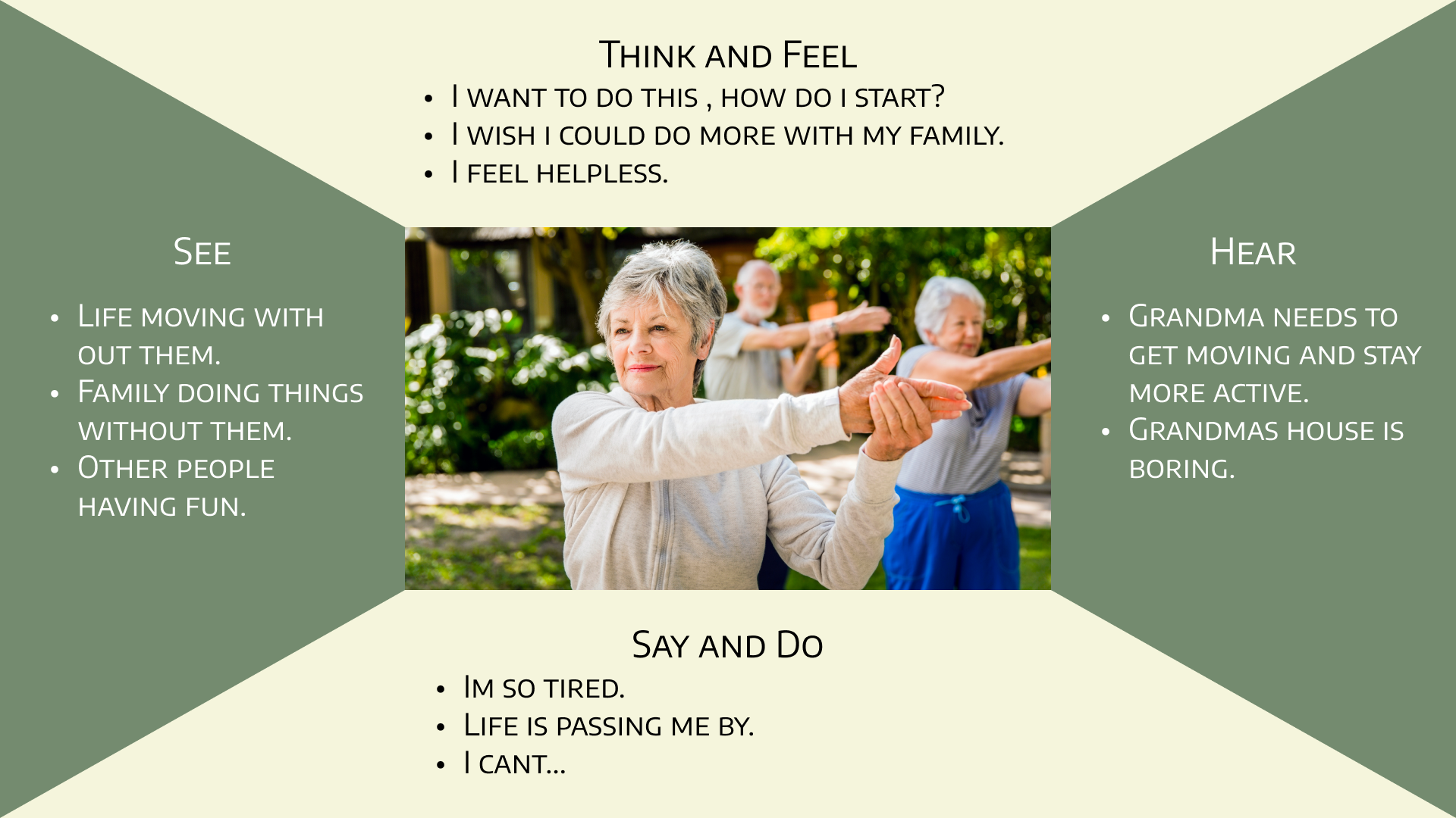
What problems are they facing?
Empathy Maps are designed to get in touch with user behaviors and feelings. To help me understand their motivations, concerns, and experiences.
Competitive Analysis
I chose to research Beach Body because it’s one of the most well-known home workout companies in the business. I also chose Senior Fitness with Meredith because it’s focused on the elderly clientele
Beach Body
Strengths: Beautifully designed, modern, lots of ways to access fitness and nutritional information and videos.
Weaknesses: Overwhelming, busy, geared toward a younger, more active crowd.
Senior Fitness with Meredith
Strengths: Geared towards seniors, Lots of information about senior health, nutrition, and lifestyle.
Weaknesses: Very broad, not much for individual help. A lot of information on one page can be overwhelming for someone who is not computer savvy.
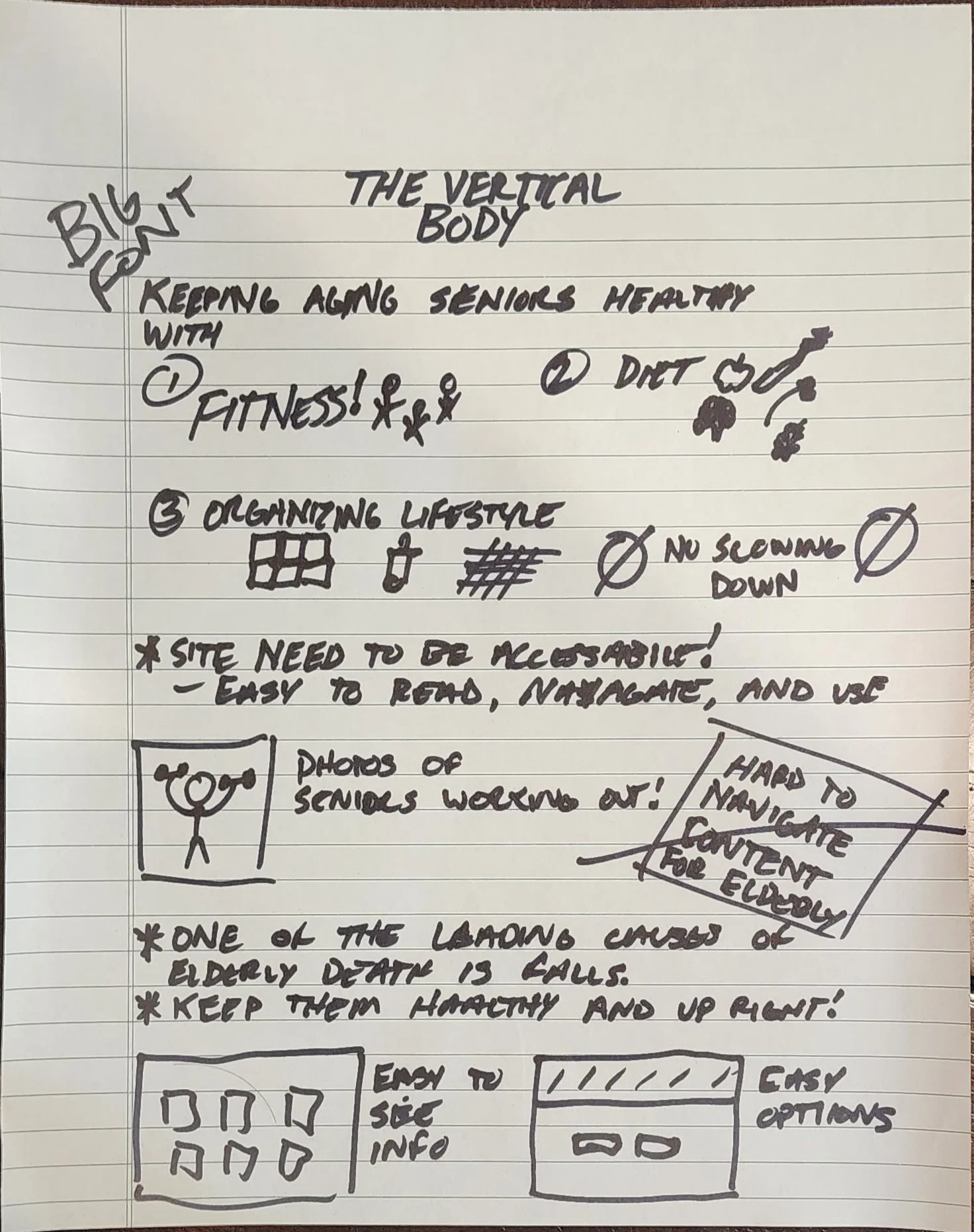
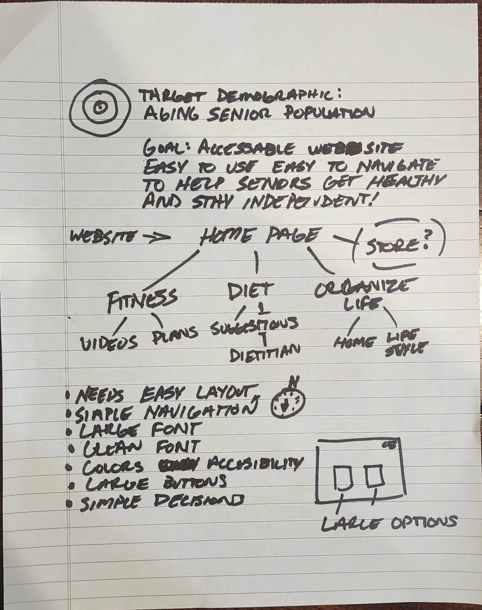
Sketches
Notes: Reviewing and gathering key information that I’ve collected through research.
1
Ideas: Creating rough doodles and starting design work on paper
2
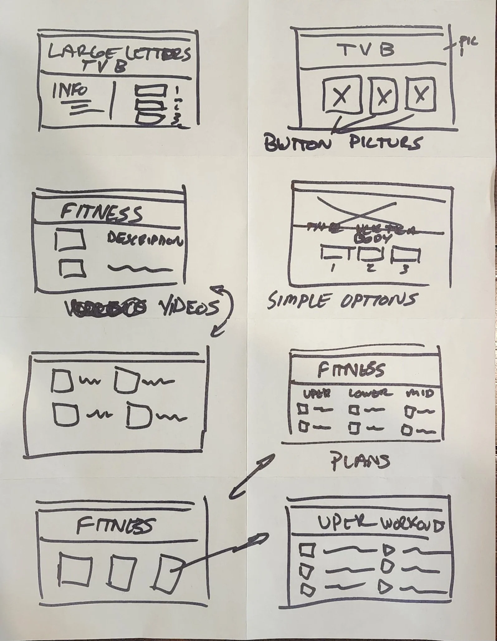
Crazy 8s: Trying rapid variations of different solutions to parts of your product
3
Solution sketch: Developing a more detailed sketch of the best one or two ideas that came out of the previous three steps.
4
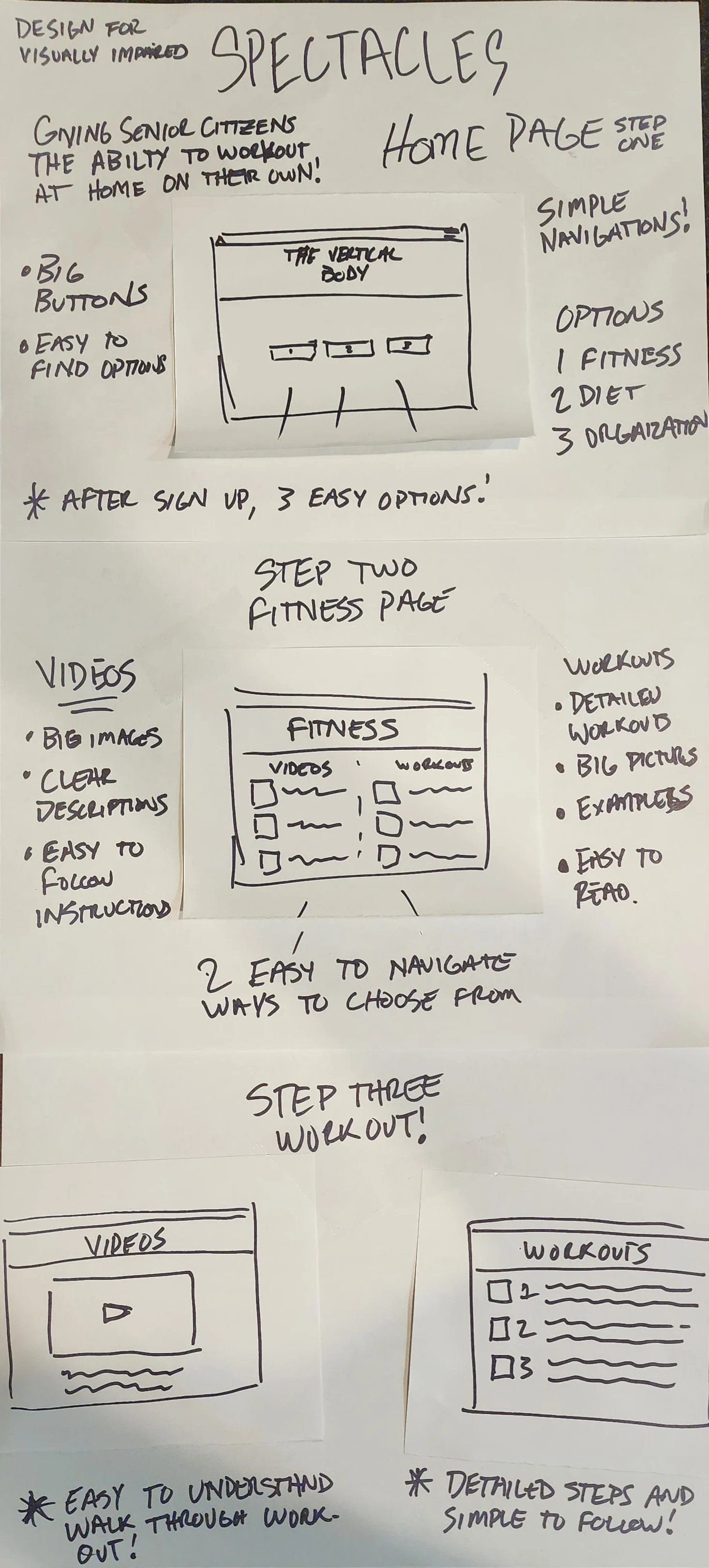
Storyboard
Storyboards helped me visualize a user flow to better understand how it works in real life.
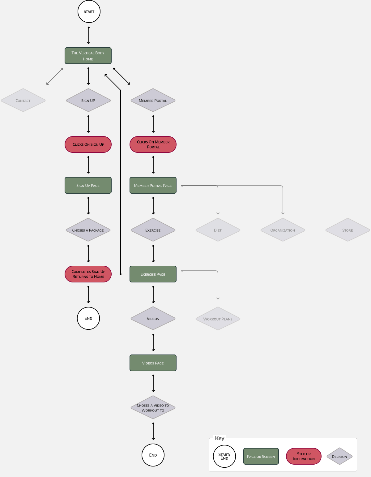
User Flows
As a senior, I want a website that is easily accessible and user-friendly, so I understand how to use it to help me reach my goals!
As a senior, I want the ability to do my workout in my own home, so that I can work out on my schedule.
As a senior, I want the ability to order fitness equipment and other health products from a trusted site, so that I can be confident I have ordered the correct items.
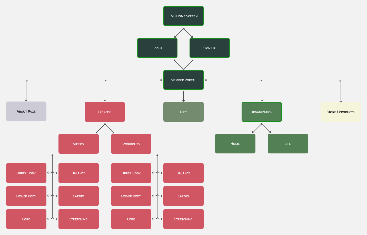
Sitemap
A simple visualization of how one would navigate the website.
Moodboard
A visual representation of how I envision the website in my head.
Wireframes
Starting to turn thoughts and ideas into a workable prototype.
Mobile Paper Prototype
Even though this project is a website, we still have to understand the mobile webpage. Creating a paper prototype allows me to physically navigate the design process for a better understanding of the website flows.
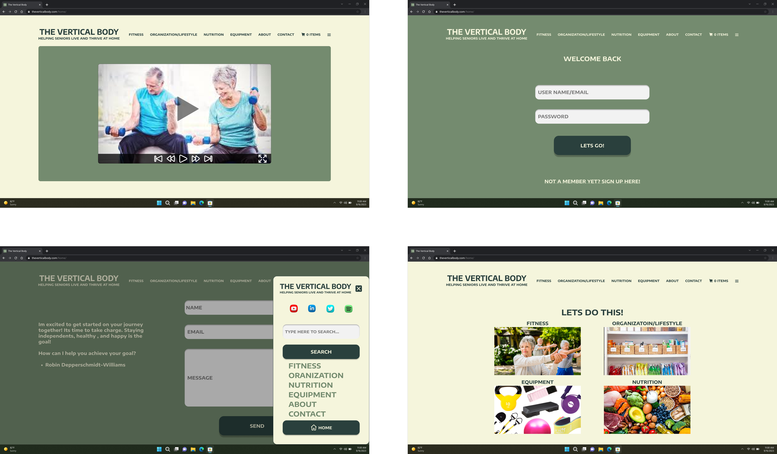
Clickable Prototype
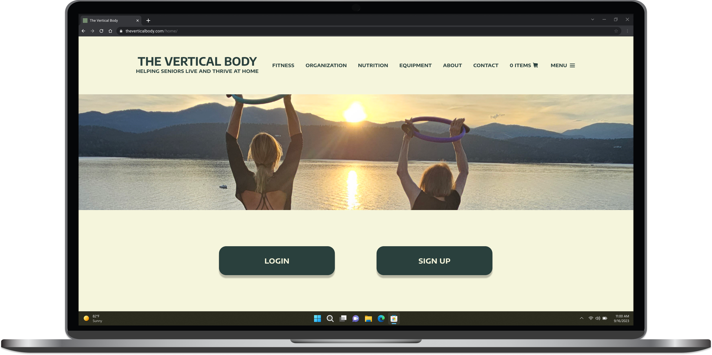
Elevation with color, shapes, and pictures makes my prototype become lucid.
Large text, buttons, and pictures help the visually impaired navigate more confidently. A minimalistic layout gives it a clean look while keeping the space from being cluttered with unnecessary space fillers.
The Test
Why we test?
Can users navigate the webpage to find the information they need?
Is the information easy to locate?
Is the information understandable?
What the test requires?
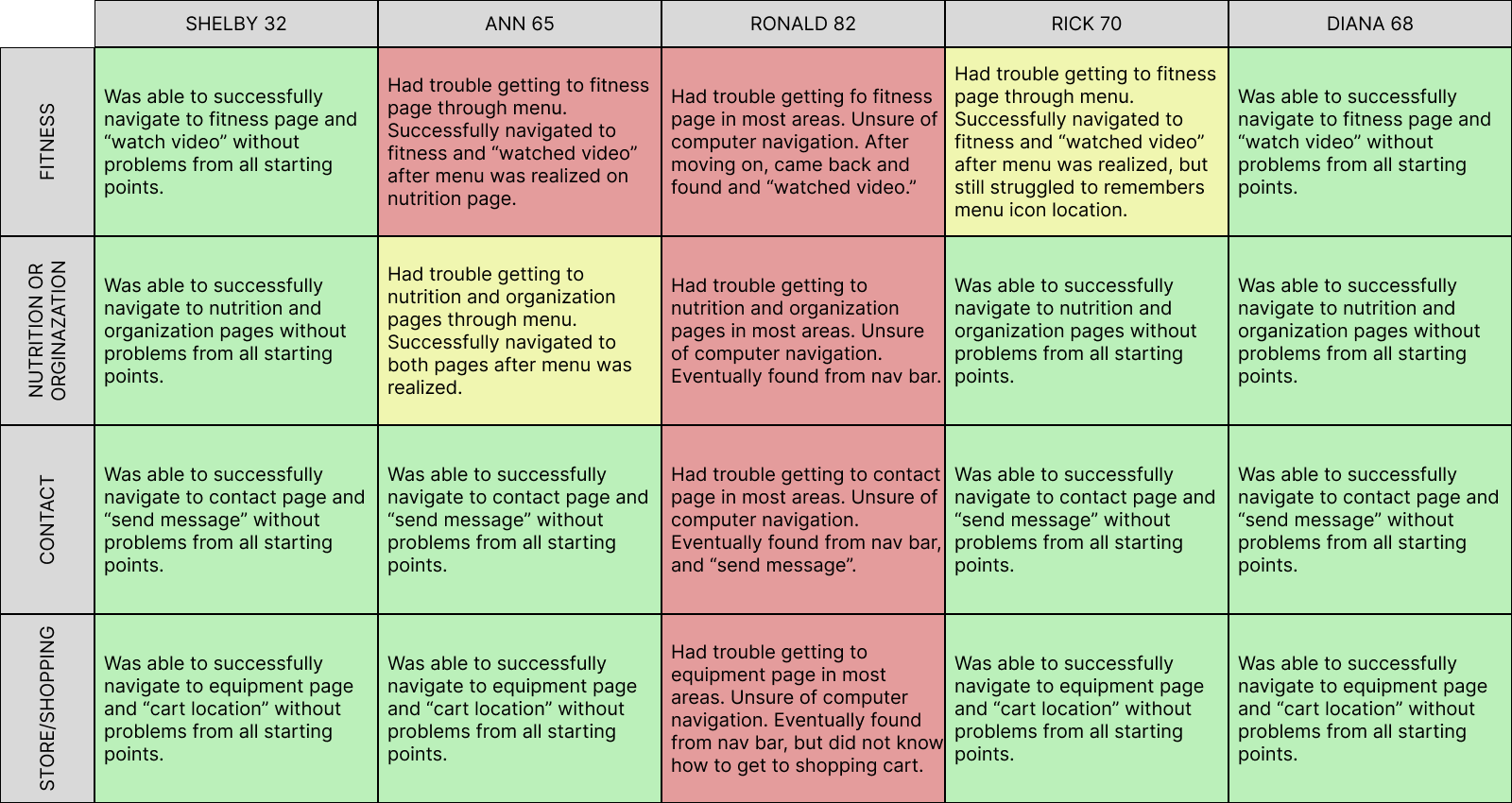
Test subjects were asked to complete multiple scenarios on a user-testing site called Maze. Users would be given certain information to try to navigate the prototype to a desired end result.
The results.
The main struggles I feel I encountered were small issues with computer knowledge in our testing group. The majority of those testing groups were senior citizens. Some with very little computer experience. The challenge became how to tweak things here or there to try to accommodate or help it look and feel more familiar.
Simple changes to the toolbar and menu help minimize confusion.
The Prototype
The next step was to present the client with a High Fidelity Prototype. Small changes help bring a more user-friendly product to the table.
The goal here was to make a product geared toward senior citizens. Easy to read, simple to navigate, and visually accessible.
Next Steps
Dive more into user accessibility especially when viewing on a mobile device.
Having a large number of users being elderly means
Greater number of clients with impaired vision
More users that may lack computer knowledge
Fewer users with mobile application or mobile web experience.
This needs to be as user-accessible as possible to help seniors navigate the page and find and access valuable information to stay healthy!
Final Thoughts
I’m immensely thankful for the opportunity to work on a project centered around helping people stay happy and healthy.
It’s rewarding to get this information out to the public, to prolong lives, and to allow senior citizens to stay independent and in their own homes.
I feel more knowledgeable about the struggles the elderly can face on a day-to-day basis. I learned how incorporating simple things like menu style or button placement, can not only help a specific demographic but can be helpful to all of us!

